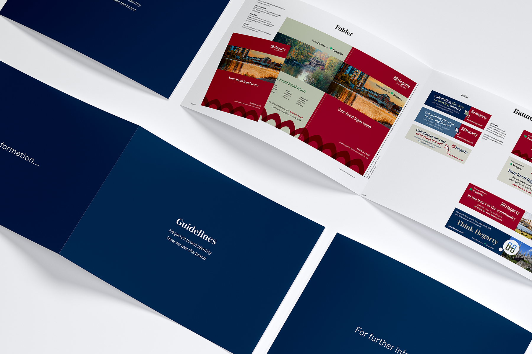
A brand evolution reflecting Hegarty's commitment to serving their local community
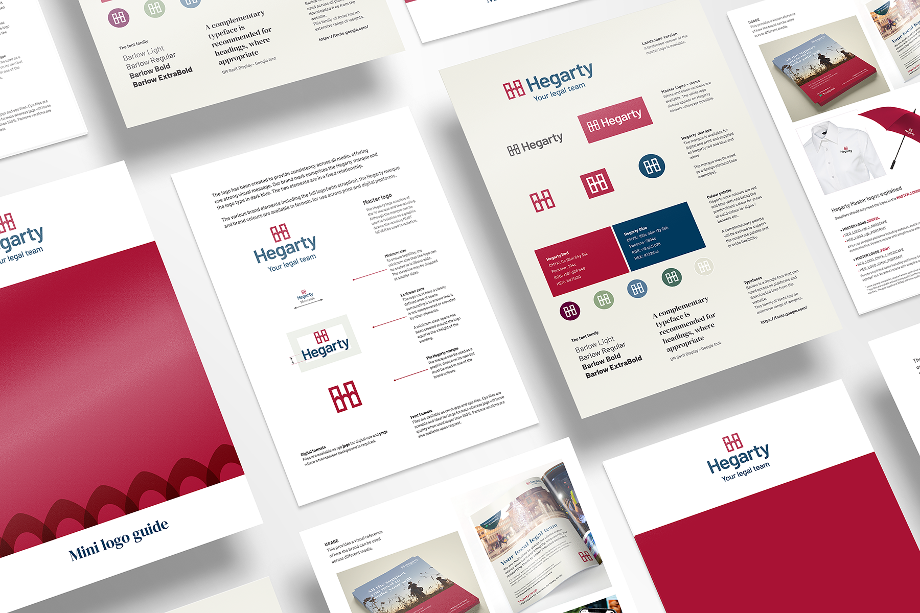
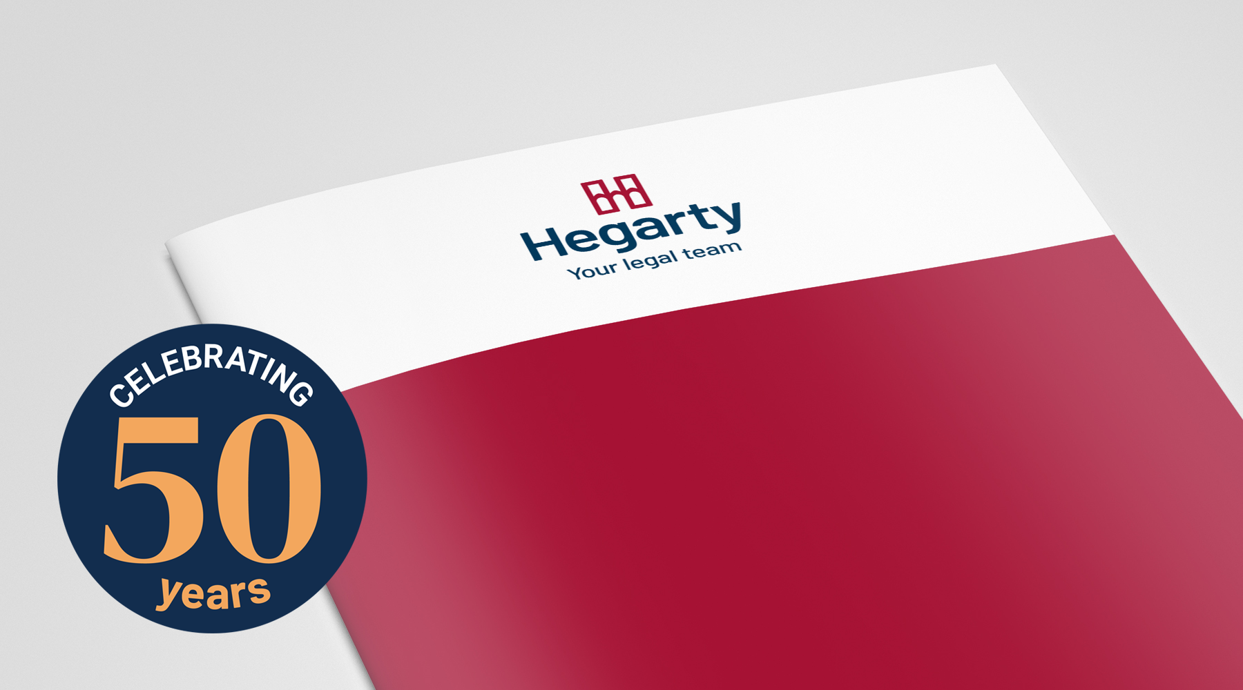
We created a significant evolution of their existing brand to reflect strong values and illustrate their position in the marketplace. This brand identity needed to visually deliver change but with some familiarity to ensure we were engaging with an existing loyal, local audience as well as appealing to potential clients too.

This project was carried out while at Dsquared Limited.
Embedded in the local community
At the heart of Hegarty is a strong connection to the communities they serve. As a trusted local legal practice supporting both families and businesses, it was important that the new identity felt rooted in the places and people they work with every day.
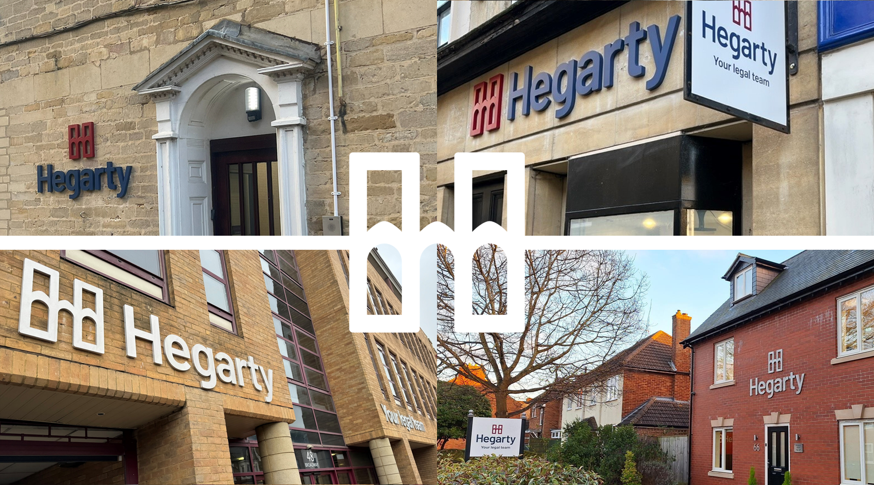
Peterborough Cathedral provided a natural source of inspiration. Its distinctive Gothic arches are instantly recognisable across the region, while their shape also echoes the bridges found in the market towns where Hegarty has a presence. Bringing this familiar local reference together with a bold, confident ‘H’ created a distinctive marque that represents connection, trust and a strong sense of place.
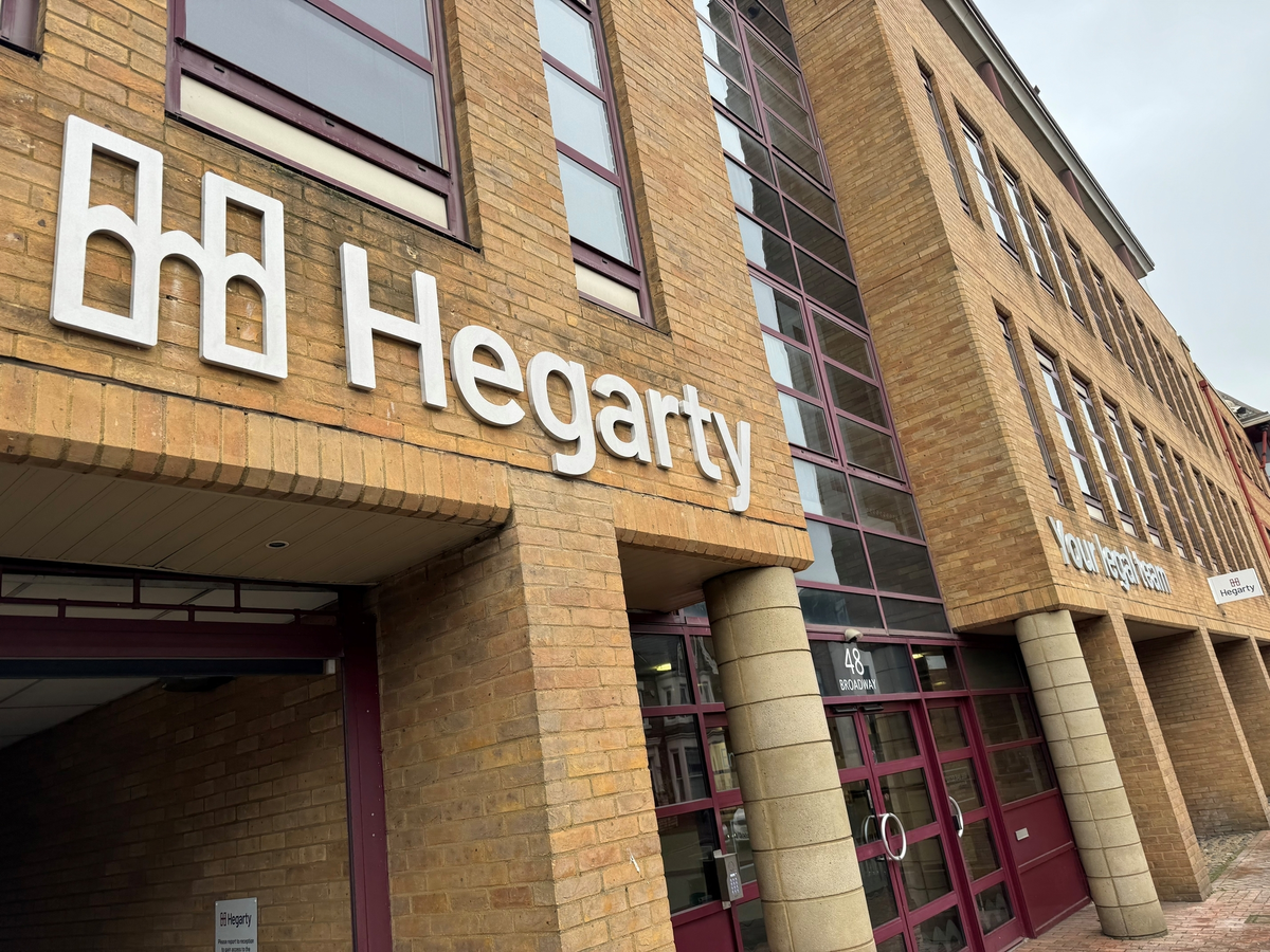
The result is a simple, memorable symbol that feels both local and contemporary, while being flexible enough to work consistently across everything from digital platforms to printed materials.